5 Design Lessons I Learned as an Architect
When people discover I was an architect prior to becoming a professional organizer, I’m often asked, “Do you miss it?” The truth is, I don’t—I still use what I learned everyday. Whether I’m working in a client’s space, organizing and renovating my own home, or assembling Minima’s website, the principles of good design are with me in everything I do.
Here are five of my favorite lessons learned as an architect.
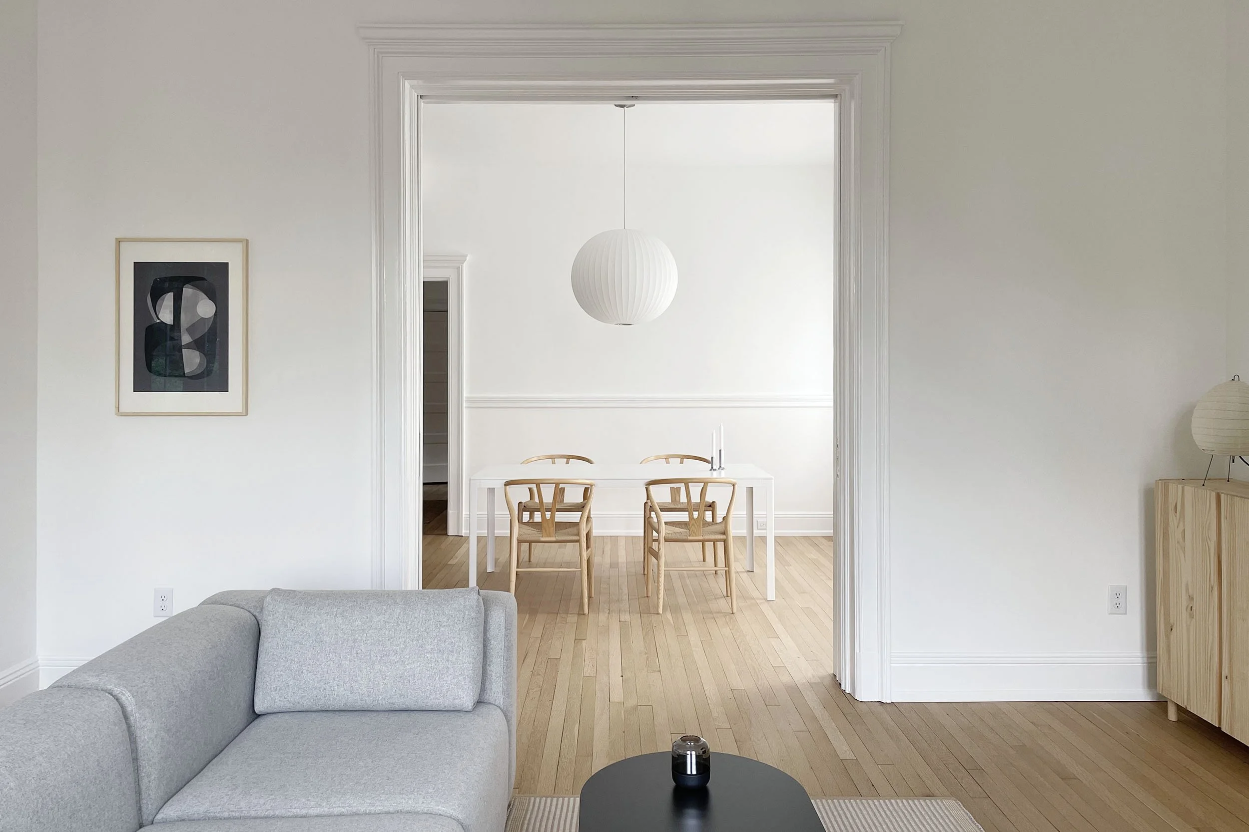
My current home in the Fan, which I share with my husband.
Simple is best, but it isn’t easy
Good design seeks to solve a problem in the simplest way possible, without excess. It’s honest and never tries to be something it’s not; form and function exist in perfect harmony. Creating a truly simple solution that works seamlessly with real world demands takes a great deal of thought and study. I’ve witnessed many designs that didn’t consider these factors and aged poorly.
“I have found that all ugly things are made by those who strive to make something beautiful, and that all beautiful things are made by those who strive to make something useful.”
― Oscar Wilde
“Style” is a four letter word
Style implies something superficial or even trendy, and good design goes deeper. When someone asks me what my “style” is, I shift the conversation into one about values and beliefs. The spaces I create aren’t driven by a particular aesthetic style, but by my core values, which are grounded in minimalism and a love for well-executed details.
Attachment inhibits good design
The first idea is almost always subpar (I speak this not with a pointed finger, but from my own experience). It’s best to keep an open mind and produce many different ideas before exploring one more deeply. This requires a more gradual, intentional approach, but the lessons learned are worth it. A stronger solution will be revealed, one that could never have been imagined from the outset.
It’s all in the details
A design that’s all big ideas and no attention to detail falls apart quickly. It may appear exciting at first glance, but it reveals its ugliness upon closer examination. During my thesis year at Virginia Tech, I modeled a diagram of a minimalist horizontal building that effortlessly floated over the Potomac River horizon in Old Town Alexandria. My thesis advisor loved the idea, but challenged me to “prove it”. The building needed to visually float in the air, so how would I accomplish this illusion from a structural standpoint? I spent months working with the engineering department to figure out the real world details to support my idea.
Allow room for play
Design is a balance between logic and intuition. It can seem serious and methodical at times, but some of the best moments in my homes have been “happy accidents”. When something feels unbalanced, I will often explore big space plan changes. In my last home, I went so far as to completely switch the living and dining room furniture for a day. I ended up putting things back the way they were, but I learned something new by changing my perspective that allowed me to make a 5% improvement. Often, those small adjustments have a massive impact on the overall design.
