A Modern IKEA Kitchen Renovation Complements a Historic Home
In 2022 when my husband and I bought our condo in Richmond’s Fan district, we knew we had a kitchen renovation in our future.
Our condo, built in 1914, had an abundance of beautiful original details we wanted to preserve: heart pine and white oak flooring, wavy glass windows, pocket doors, detailed millwork, and solid brass hardware. Before we moved in, I spent several months managing the restoration of the entire 1500 square foot space. It was a labor of love and I worked with some of the best people.
The main restoration took all of the time we had, so we chose to save the kitchen for a later phase. After living in the home for about a year, my vision for the new kitchen crystallized, which happened to align with my favorite contractor’s availability. We started the project in December 2023 and finished in January 2024.
The new kitchen design was inspired by Reform, MUJI, and Dieter Rams. We love the visual rest provided by the open wall—the Benjamin Moore Regal select flat paint is easy to wipe clean.
The new layout
The kitchen is an L-shaped room that wraps around the building’s three-story service staircase. Our condo is on the top floor, so we couldn’t (easily) move any major walls or plumbing drain lines. We leaned into these limitations by keeping the sink and range in the same location.
The old layout had a bar area with a second sink, which seemed redundant given the size of the kitchen. We replaced the bar area with floor-to-ceiling cabinets containing our pantry and a concealed fridge/freezer. Relocating the fridge gave us a long, continuous work surface perfect for preparing meals.
A quiet design
The space had a lot going on: four doors, two windows, and two different ceiling heights. The new kitchen design is calm and quiet, allowing the architecture to breathe. I considered the Danish-based company Reform for our new cabinets, but ultimately decided on a Reform-inspired IKEA kitchen. I loved my old IKEA kitchen and knew there would be a dramatic cost savings compared to Reform. Plus, the IKEA VEDDINGE white fronts perfectly matched our white walls (Benjamin Moore’s Chantilly Lace).
We’re so pleased with how it turned out! Check out these dramatic before and afters, photographed by Mindie Ballard. I included a full source list at the end of the post.
BEFORE facing west | The old layout had a bar area with a second sink.
AFTER facing west | We replaced the bar area with floor-to-ceiling cabinets containing our pantry and a concealed fridge/freezer.
BEFORE facing east | The old layout didn’t maximize the L-shaped kitchen.
AFTER facing east | The new design prioritizes functional work surface and creates a feeling of compression and release.
BEFORE facing southeast | The old layout had plenty of storage, but felt disjointed.
AFTER facing southeast | The new design allows the architecture to breathe. Drawers maximize storage space.
BEFORE facing south | The old layout felt cramped and cluttered.
AFTER facing south | The new design is bright and welcoming. We restored the antique security glass that was hidden under the mirrors on the service stair window.
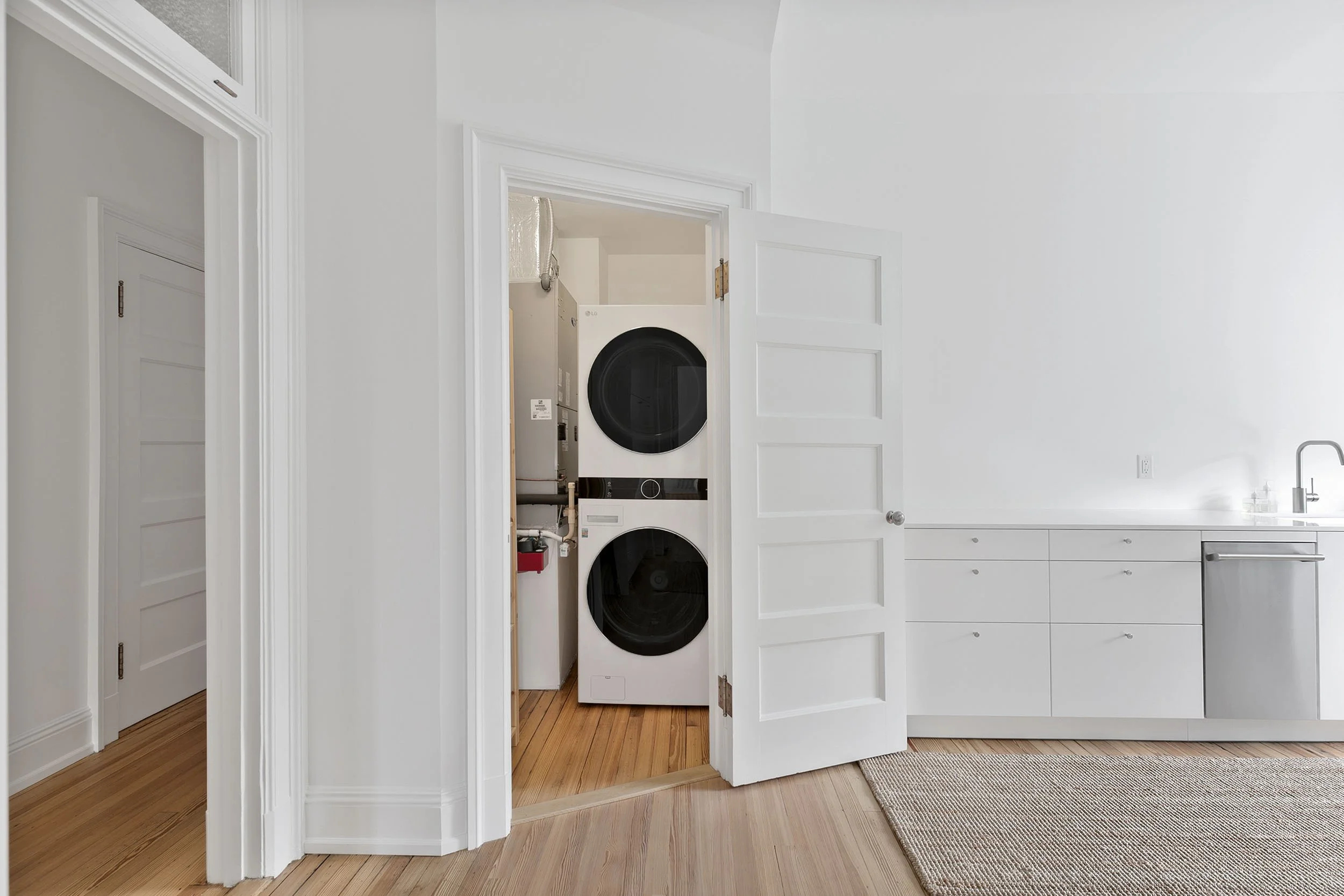
We have a utility closet for laundry and HVAC tucked within the kitchen.
Source list
IKEA cabinets | SEKTION kitchen cabinets | VEDDINGE white fronts | BAGGANÄS knobs
IKEA appliances | (2) SUPERKALL built-in panel-ready refrigerator | VILLKORLIG built-in dishwasher | TVÄRSÄKER range with induction cooktop | ÖMSINNAD under cabinet range hood
IKEA sink | VRESJÖN sink | ÄLMAREN faucet
Countertop | Silestone quartz in iconic white, 2 cm, polished, flush-edge installation
Lighting | Ascoli twin light track fixture | Ascoli triple directional track fixture
MUJI accessories | Acacia bowls | PET rectangular soap bottles | Stainless steel dish rack | Cutlery stand | Dish drainer tray | Analog clock
Other accessories | Fine Little Day tea towel | HAY flowerpot with saucer | Hasegawa step stool
Rugs | IKEA LOHALS jute runners | HAY door mat
Paint | Benjamin Moore Chantilly Lace
Flooring | Original heart pine flooring refinished with Loba 2K Invisible


